Argyl
Argyl is a short-term rentals platform that combines the warmth of traditional hospitality with modern tech. The brand sits between large, impersonal operators and smaller family-run businesses, offering a considered, people-focused experience.
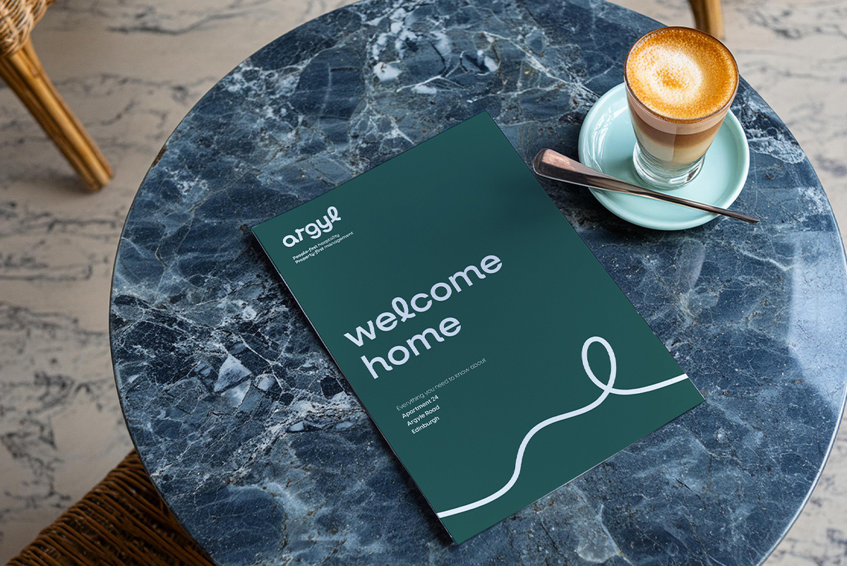
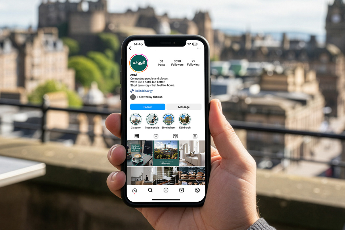
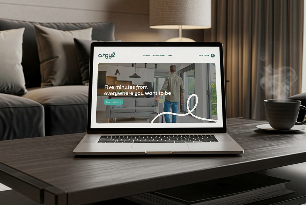
I created the logo and full brand identity, built around the idea of connecting people and places. The logo is curvaceous and approachable, designed to clearly differentiate Argyl from more corporate-looking competitors in the market and the form of the letter L inspired a graphic device used throughout the brand, visually representing the connection element of the brand and adding softness.
The brand needed to work across B2C and B2B audiences, so I developed two complementary palettes — inviting colours for guest-facing comms and a heritage-led palette for landlord and investors.
Deliverables
- Brand identity & logo
- Typography & graphic device
- Identity for B2C and B2B audiences
- Brand guidelines for digital and print communications
- Additional roll out materials